Using color wheels for better mixing
My journey exploring color wheels to better optimize my mixing palette
For a while I had been meaning to refresh my watercolor palette. The other day, I was snooping around the internet and came across a reddit post which talked about color mixing in watercolor.
It explained why sometimes our color come out muddy and less vibrant, using a color wheel. The gist is that whenever we mix two colors, we can never increase their chroma or saturation. Thus, for mixing vibrant colors, you want to use very high chroma pigments that are not opposite each other on the color wheel. On the flip side, low chroma colors are better at neutralizing mixes.
Introducing the CIECAM Color Wheel
We can find those by using a color wheel using the CIECAM color space. They shared this color wheel from Handprint:

CIECAM is a color appearance model (CAM) based on how humans perceive color. No model is perfect, but it gets closer than other models that focus more on color mapping for other purposes, like uniform color spaces.
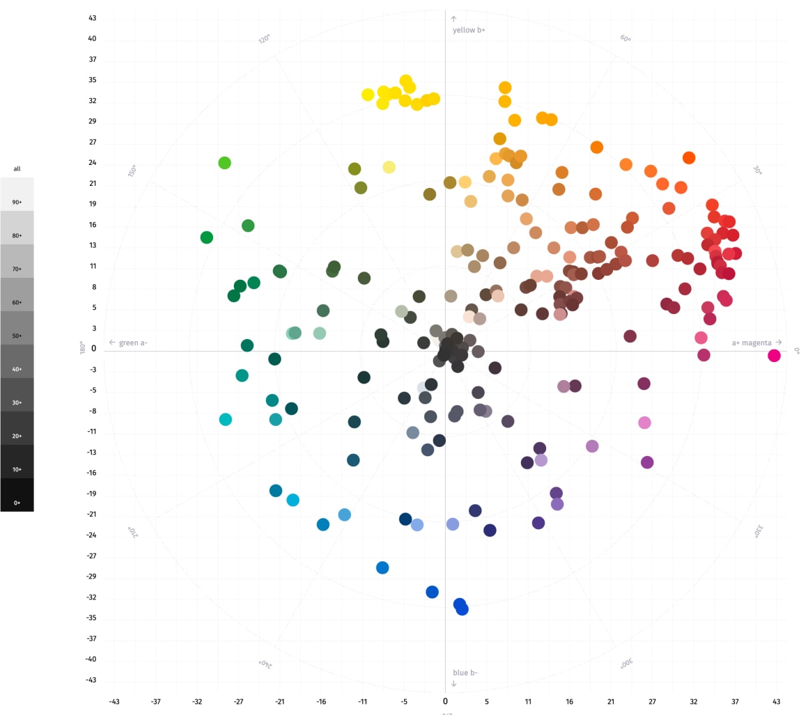
The color wheel above is in polar coordinates - the distance from the center (radius) representing how high the chroma/saturation is. Colors near the outside of the circle have higher chroma. The angle represents the hue (red, blue, green).
All of this was very enlightening but also frustrating as newer color formations are not represented on that chart. If you don't know yet, I'm a web developer when I'm not making art. You can probably guess what happened next...
Building my own for newer color formulations
I decided to build my own color wheel.
Most of my watercolors come from Daniel Smith, and they publish CIELAB values for their colors. This isn't quite as good as CIECAM, but better than nothing. You can find the result on my website at Daniel Smith Watercolors CIELCh Color Wheel, and here's a screenshot:

It is interactive so you can click a color to show/hide its label.
I had big dreams about how I could create a larger web application for exploring color. Then, after about 10 hours of working on that, some random Googling landed me on Artist Pigments which is so massively superior, I'm not even angry.
A better tool: Artist Pigments
In case you haven't discovered it yet, ArtistPigments.org presents color data on nearly every paint brand for both watercolors and everything else. They also have color wheels based on the CIECAM16 color space which is superior to CIELAB for this purpose.

You can even create an account to save your various palettes into collections. For example, I love Horizon Blue by Holbein, and I can view it in the color wheel for my landscape palette collection. Eventually, they plan on making collections shareable.
What you were taught about the color wheel is all wrong
We're taught that the primary colors are red, yellow, and blue. We're also taught that their complements are green, purple, and orange, respectively. However, if you take a look at the color wheel, we can see that the hue angles don't really line up that way.
In reality, the complement of blue is orange, but the rest is a bit off: blue-violet is the complement of yellow and blue-green is the complement of red. You can read some really great analysis of this and why a secondary palette gives you a wider gamut than a split primary palette in this very in-depth article from Handprint: Misconceptions in traditional color theory.
Final palette decisions
I should say "for now" because are palettes ever final?
Limited palette
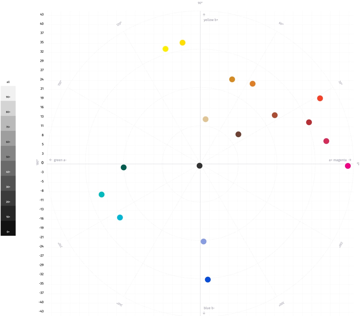
For my 6-color limited palette that I carry around in a tiny Altoids tin for sketching on the go, I didn't end up changing anything. It's nice to know that this palette has survived multiple attempted iterations. I'm very happy with it as a limited palette. Here is its color wheel and colors (all Daniel Smith):

- Hansa yellow medium
- Quinacridone gold
- Carmine
- Ultramarine blue
- Phthalo green (BS)
- Transparent red oxide (sometimes substituted with burnt sienna)
Landscape palette
This is the palette I take for larger outdoor expeditions but also sometimes use at home for convenience over my large at-home palette. All are Daniel Smith except Horizon Blue which is Holbein.

- Hansa yellow light
- Hansa yellow medium
- New gamboge
- Quinacridone gold
- Organic vermillion
- Carmine
- Quinacridone rose
- Opera pink
- Lavender
- Ultramarine blue
- Horizon blue
- Cobalt teal blue
- Phthalo green (BS)
- Lunar black
- Burnt umber
- Burnt sienna
- Mars yellow
- Buff titanium
I could probably widen the gamut by adding a color like phthalo yellow-green. First, I need fiddle more with the yellows, oranges, and blues to whittle them down to fit it in.
Conclusion
If you've struggled mixing colors, try using a color wheel in the CIECAM space like on ArtistPigments.org to help you analyze why. If you'd like a longer write up on mixing theory in this space, this deep-dive by Handprint is great: An artist's color wheel.
Don't miss a post
Sign up for my newsletter to be notified of new posts!